Context
Erbilin is a local olive oil brand rooted in craftsmanship, simplicity, and quality. The brand produces olive oil from its own gardens and reflects a clean, minimal approach shaped by authenticity and care.
My Role
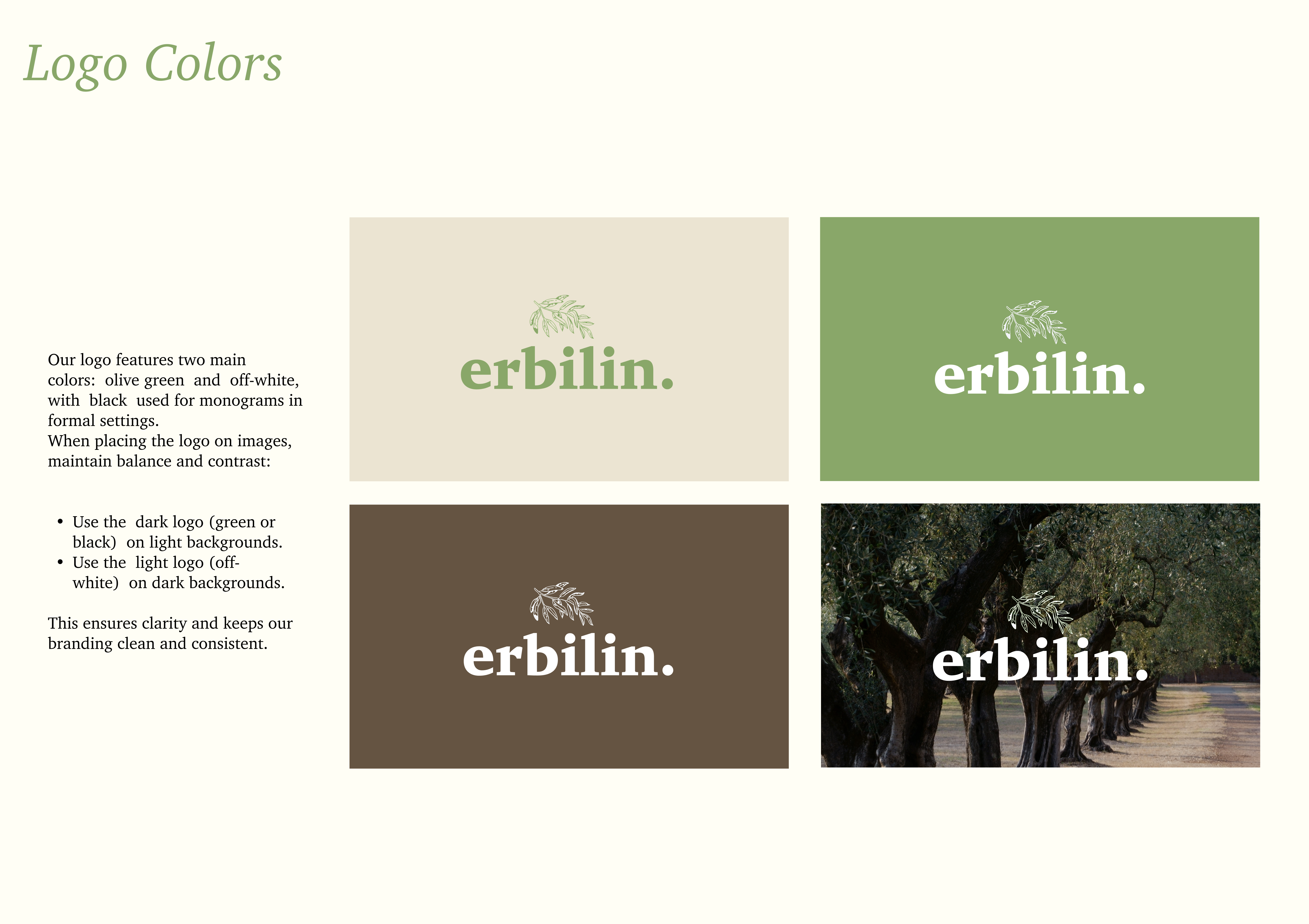
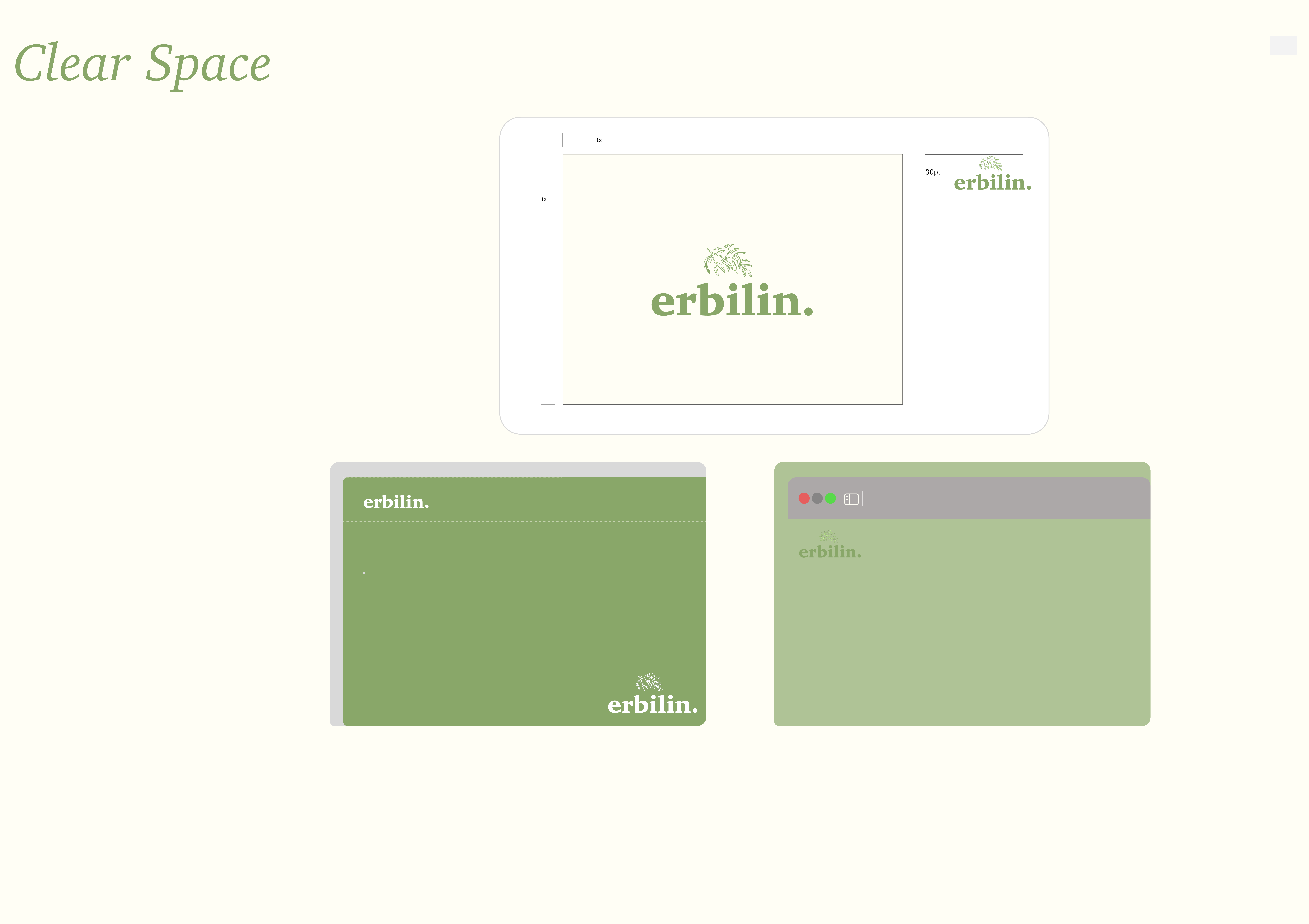
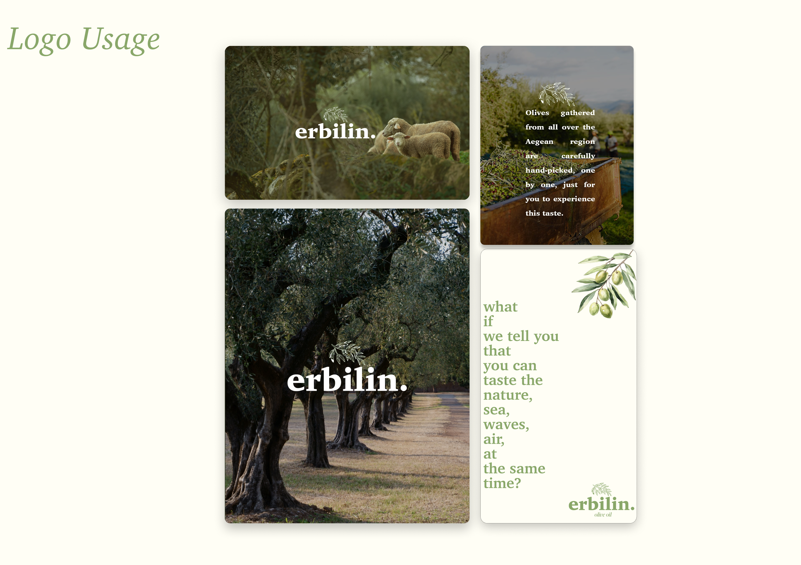
I created the brand identity from scratch, including the logo, colour palette, typography, and core visual direction. I also defined the tone and overall aesthetic to ensure the brand felt clean, warm, and true to its origins.
The Problem
The brand needed a clear and refined identity that could reflect its local roots, handmade quality, and natural elegance without feeling overly complex or commercial.
Approach
I developed a minimalist visual identity built around simplicity, balance, and authenticity. This included the logo, colour palette, typography, and supporting brand elements to create a clean and consistent system across the brand.